GET YOUR MAPS HERE
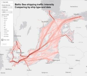
We have processed and made available shipping density maps and data spanning ten years, from year 2006 to 2015. All maps are available through the HELCOM AIS Explorer.
The maps were created from quality controlled AIS data, Automatic Identification System data. The data allows you to compare the shipping data by months and by ship types.
This is the first time ever that this huge amount of data has been processed for the Baltic Sea region. How huge it the data set, you ask? Well, the year 2013 alone contains 1.3 billion rows. If you were to print that, you would need 30 million A4 pages. If you put those pages one after the other, they would reach from the Baltic Sea to South Africa.
HOW-TO
If you want to know how to make maps like these, check out our report Mapping Maritime Activities within the SCOPE Planning Area. It explains the key steps to create shipping density maps, from raw data, cleaning and sorting by month, to making the actual maps. And the code is open source and will be available on GitHub.
The report also includes some reflections on mapping fisheries and renewable energy, mainly wind power, in the Baltic Sea region.
Check out our report here.


